MON - FRI: 08:00 - 05:00 PM

Pastel Colors - Colors of Desig - Photo by Mike Yukhtenko, Unsplash

Pastel Colours in Your Interior Design

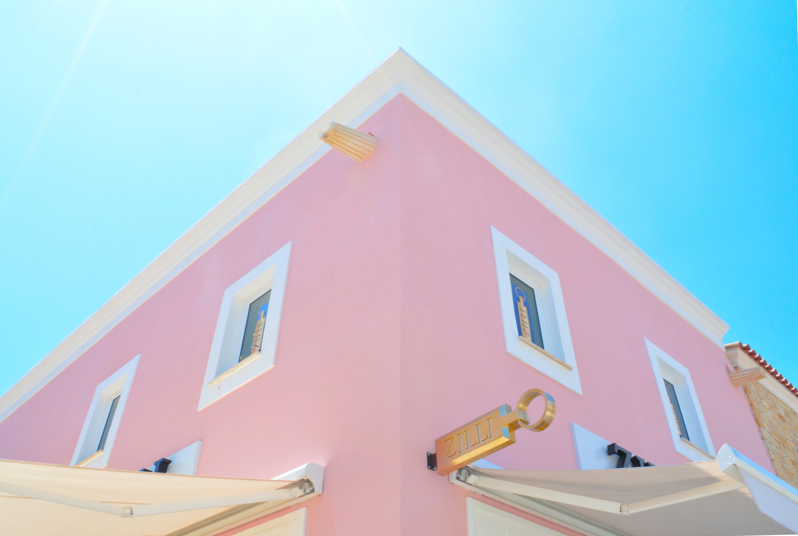
We Love Color Pastel!

Pastel colors can be used with a variety of decorative styles. You can combine pastel colors between themselves as a variety of pastels or just adding your favorite shade of yellow or gold, perhaps a sophisticated gray, or any combination you pick will look stunning in your home.

Pastel colors are pale tints of primary and second colors.

Pastel colors are able to retain the vibrancy and brightness of color and they have the ability to soothe and calm the viewer.

If there is a need of peace, harmony and tranquility in your home, you will do the right choice by adding one or two walls of your favorite hue. At Colors of Design we can guide you with your right color combination and selection. We love working with pastel colors as we know how they can change the mood of the interior design of your home. Also, pastel colors represent an enormous break off the dark and moody colors of winter; pastel colors represent spring and summer months.

Colors that represent beauty and happiness.

Pastel Colors | Colors of Design - Professional Interior Design

Traditionally associated with femininity and motherhood, pastel colors are often used to decorate the bedrooms of young children. Pastel’s youthful tendencies extend to associations with lightness, joy and optimism.

However, pastels are not always exclusively associated with the female gender. Their origins have led to a connection with sports and masculinity, especially when combined with dark navy or green

Colors of Design - Interior Design - Children's spaces

Pastel pink can be achieved by mixing vivid red with a white, per example. This combination gives pastel colors an innate vitality and brightness, despite their diluted hue.

Pastel Colors - Interior Design - Colors of Design
A Little History of Pastel Colors

In history, vegetable dyes offered dark, muddy shades, or fabrics were simply worn un-dyed. It was the aristocratic classes who were able to be more experimental with color on their clothing, as they had the means to access expensive and rare dyes.

While white, cream, and beige hues were favored by some cultures, such as the Ancient Greeks and Romans, it wasn’t until much later that clothing was purposefully dyed with pastel pigments for the sake of fashion. In the early 18th century in France, the Rococo style, which favored sensuous, pretty design across interiors and clothing, made pastel tones extremely popular among the wealthy classes.

Madame de Pompadour, the influential mistress of Louis XV, is credited with spearheading the Rococo trend for pastel tones. But it is perhaps the later Marie Antoinette who is best known for her love of pastel colors, favoring baby blue and pale pink in particular.

Pastel Colors - Interior Design by Colors of Design

During the Victorian period, a new social trend emerged amongst the middle classes in Europe—the holiday. Pastel colors became synonymous with vacations, with candy-stripe umbrellas and deckchairs in soft shades of cream, lemon, mint, and pink defining the scenery of beach resorts in England, France, and Italy.

Pastel Colors by Colors of Design - Interior Design

The association of pastel colors with holidays continued well into the 20th century. With the birth of Technicolor in film, joyful and optimistic pastel hues found a natural home in the costumes and sets of the movies created during the Golden Age of Hollywood.

Pastel colors have not always been exclusively associated with the feminine. In the early 20th century, pastel colors were the first choice for discerning sportsmen and fashionable gentlemen, who often opted for pale pink polo shirts and suits. This has led to pastel colors being commonly connected with fashion and college culture.

Interior Design - Pastel Colors - Colors of Design
Pastel Colors - Interior Design | Colors of Design

Today, pastel color continue to be a beautiful color choice for vacation homes or homes located in the tropics or anywhere in the world.

Colors of Design | Pastel Colors - Interior Design
How to Design with Pastels

Pastels really come into their own when used collectively, you won’t go wrong adding a summer or vintage vibe into your designs.

Be brave, liberal, and extravagant. The result may be more chic than you expected.

Colors of Design | Pastel Colors - Interior Design
What Colors Go With Pastels?

You can combine the low hues of the pastel colors with cobalt blue, metallic grays, maroon.
Copper or gold will create contrast and conjure a luxurious mood.

Ready to start using pastel colors in your home design? Discover three décor color palettes to make the most of pastel hues in your home.

Navy - Décor Color Palettes - Colors of Design
Navy
Retro - Décor Color Palettes - Colors of Design
Retro
Edgy Ice Cream Style - Décor Color Palettes - Colors of Design
Edgy Ice Cream Style

Contact us for color theme consultation. You’ll be happy you did. Until then. Let’s keep designing…

What We Do

Great Ideas for Great People

Our services include a wide range of design services in Miami, Naples, Palm Beach & Key Biscayne. From full residential design analysis to space planning, design concept development, furniture plans, custom design, construction drawings, product specifications, purchasing, installation of materials & project management.

Comments

Just Say Your Opinion

Your Comment